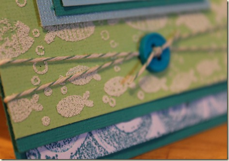
Here’s my card. What do you think? These colors were a little hard to use for me. A little to monochromatic!
So, here’s the funny story about this card…while we were driving home from vacation earlier this week I watched several Stamp TV episodes on YouTube. I was unable to watch the tutorial video for this weeks class for the Summer Card Camp. I fell in love with this faux letterpress technique. I decided what my card was going to be while still on the road. So, imagine my surprise when I was finally able to watch the tutorial this week!
I also used some new “puffy” embossing powder for the little fish. I’m not sure what to think of it, any suggestions would be appreciated! It seemed to take forever to melt and then it didn’t really look smooth.
All of the cardstock and stamps are Stampin’ Up, except the shiny blue cardstock, I think it’s Bazzill’s. The ink is Tim Holtz “broken china” distress ink. The embossing folder is Cuttlebug Swirls.


2 comments:
I just love you and all of your craft knowledge. :) I think the card is adorable! In fact, I wish I had something like it to give to my VBS kids tonight. You've inspired me!
Loved how your card turned out....looks like a water coloring. TFS! I'm now a new follower. :)
Post a Comment